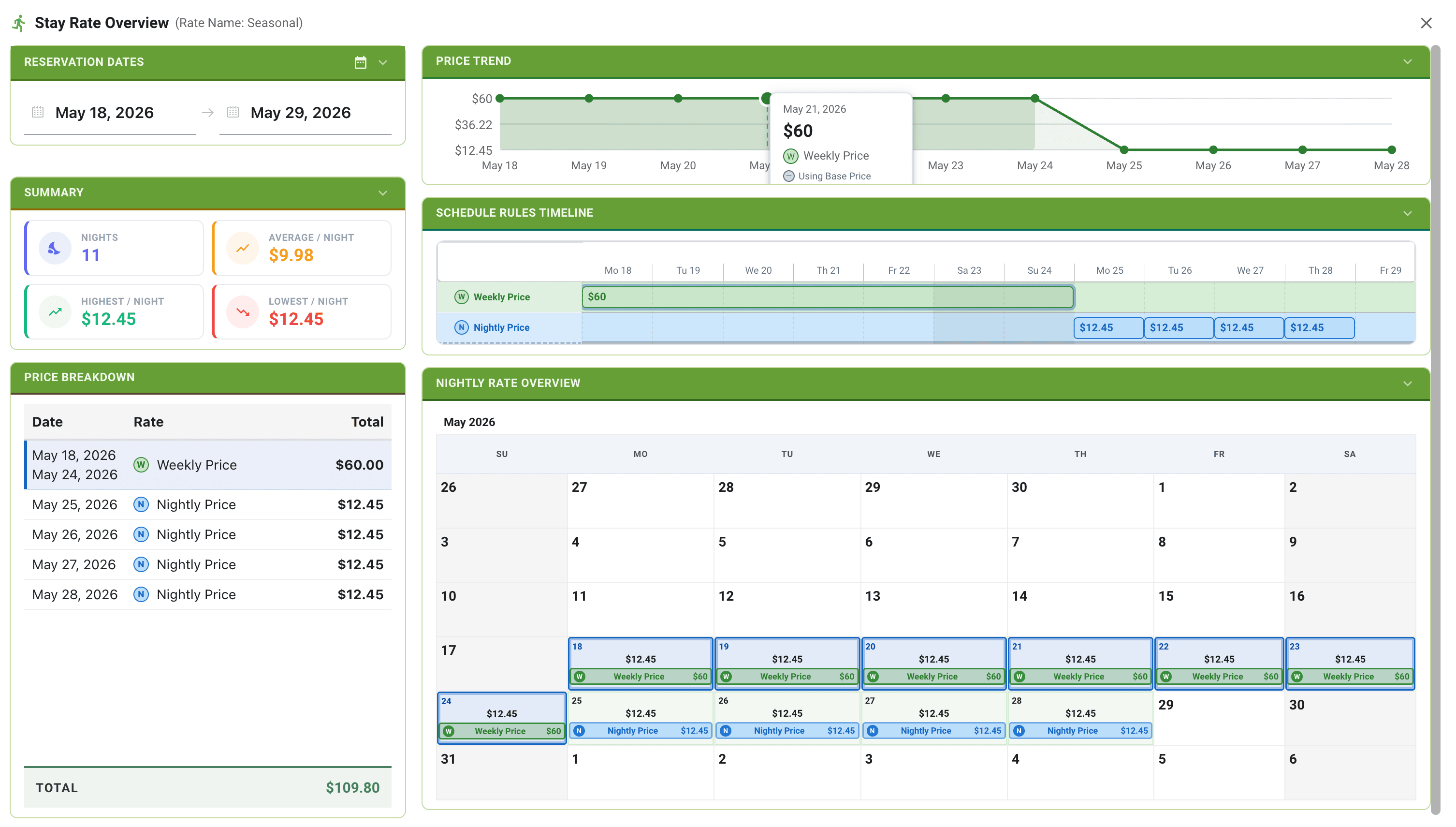
Stay Rate Panel
The Price Detail Panel gives you a complete breakdown of how any stay is priced — night by night, tier by tier. It shows exactly which pricing rules apply, which tier is used for each date range, and how the total is calculated.
Opening the Price Detail Panel
The panel can be opened from several places in the app:
- From the Schedule Rates tab — click View Price Details in the Live Pricing Preview panel while testing a date range.
- From a reservation — click the price detail icon above the camping rate total in the reservation edit panel.
- From a new reservation on the timeline — click the icon in the lot selection popup.
- From the camping spot selection panel — click the icon in the spot selection screen.
![]()
Date Selection
At the top of the panel, a collapsible Date Selection section shows the current arrival and departure dates. Click either date to open a calendar picker and change them.
Changing the dates recalculates all sections of the panel instantly — the summary, breakdown, trend chart, timeline, and calendar all update live.
You can also use the Seasonal Dates dropdown to prefill dates based on your campground's configured seasonal period.
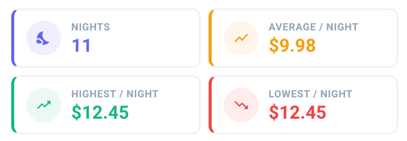
Summary
The summary section shows key statistics for the selected stay:
- Total — the full cost of the stay.
- Nights — the total number of nights.
- Average per night — total divided by nights.
- Highest nightly rate — the most expensive single night.
- Lowest nightly rate — the least expensive single night.
Price Breakdown
The Price Breakdown table explains the total stay cost row by row. Each row represents a contiguous date range where a single pricing tier applied.
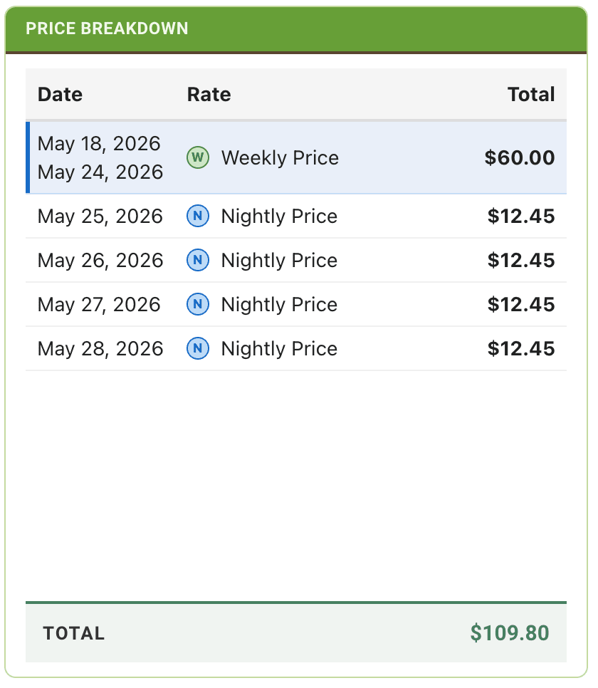
What each row shows:
- Date range — the start and end dates for this pricing segment.
- Rate badge — a color-coded letter badge (D, W, B, M, S) indicating which tier priced this range (Daily, Weekly, Biweekly, Monthly, Seasonal).
- Source — if a scheduled rule applied, the rule name is shown. If the base rate applied, "Base Rate" is shown.
- P badge — a green "P" badge appears if the Base Rate had "Priority Over Schedules" enabled for this tier, meaning the schedule was overridden.
- Fallthrough chip — a teal chip appears if this segment fell back to the base rate because the schedule rule left this tier blank.
- Row total — the cost for this segment, right-aligned.
Hover interaction: Hover over any row to highlight the corresponding dates in the Trend Chart and Pricing Calendar.
The Total bar at the bottom of the table shows the full stay cost.
Trend Chart
The Trend Chart is a line chart showing the daily rate for every night in the selected stay. The Y-axis shows price; the X-axis shows dates.
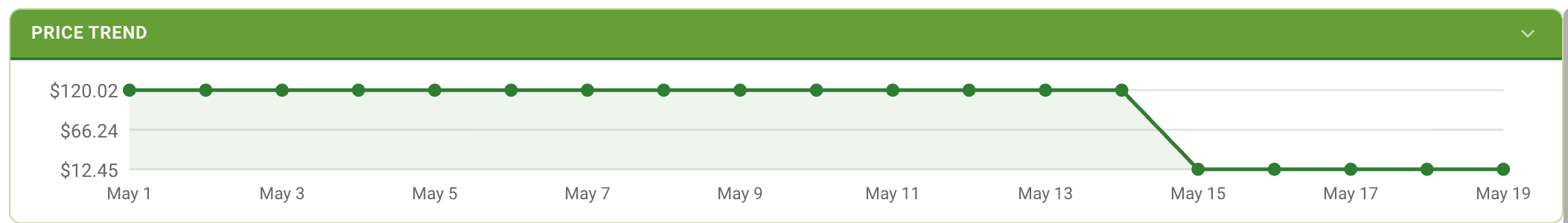
- Move your cursor over the chart to see a vertical marker and tooltip showing the exact date and daily rate.
- The currently selected date range is shaded to make it easy to identify your stay within a longer period.
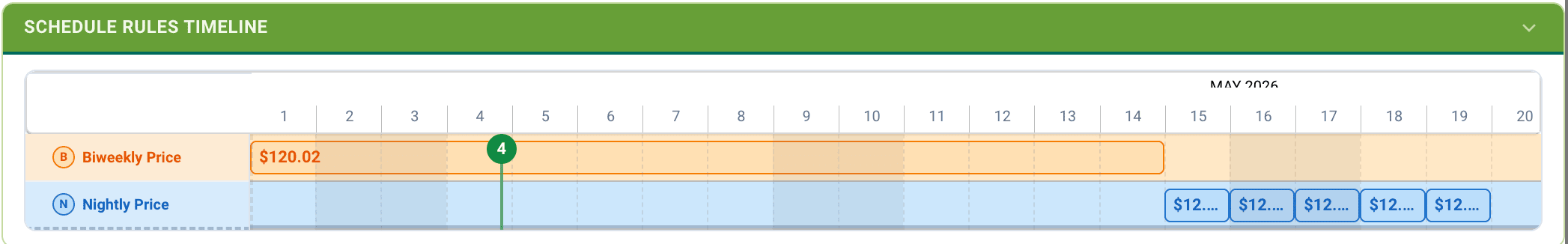
Timeline View
The Timeline View shows a calendar-style grid with one row per pricing tier (Daily, Weekly, Biweekly, Monthly, Seasonal, and Scheduled). Each day in the date range is color-coded to show which tier was active on that day.
This view makes it easy to see, at a glance, where pricing tier transitions happen across your stay — for example, where a weekly block transitions back to nightly pricing at the end.
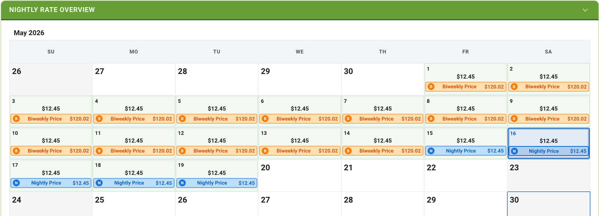
Pricing Calendar
The Pricing Calendar is an interactive monthly calendar showing the nightly rate for each day within the selected period. Days are color-coded by rate intensity — higher rates appear in a deeper color, making it easy to spot peak pricing at a glance.
Click any day in the calendar to set it as the arrival date and recalculate the stay.